I created this image a few years back after flipping through my copy of the Art of Monsters Inc. I loved the art in this book, but I was really blown away with the depth of mood and color that Dominique Louis was able to capture with his pastel sketches. There was one particular image that surprisingly captured my attention though.
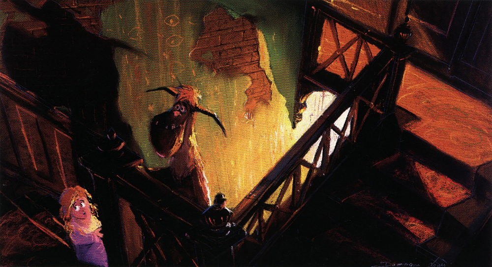
I say surprising because it wasn’t the most beautiful, or the most detailed or the most colorful image. Nor was it the most beautifully rendered or thought provoking piece of Loius’ that appeared in the book. At least not in the traditional sense. I guess it struck me for the same reasons that many other pieces in the book had. While the sketch was able to pull me in to a high degree, it was more effective at getting me to wonder about everything in the space that the camera was not seeing. The wider space that was only hinted at. The super bright light, piercing through the darkness from the stairwell below, suggested a place from which they came. The warm light silhouetting the other worldly details of the upper landing gave them a place to go, along with the door at the top of the stairs. Perhaps Mike, and God know what else, was waiting for them on the other side of that door.

I saw Monsters Inc. and loved it. Pixar did a great job of making sense of how the monster world worked and differentiating from the human world. Not for a moment, did I question where we were in the story. But as I flipped through the Art of book that day, it was these worlds that I wanted to see brought to life next. So, I thought to myself… “Wouldn’t it be neat to flesh one of Louis’ pastel sketches out in 3D.” I immediately focused on the sketch above. As I alluded to before, Dominique Louis is a master of texture, color, mood and lighting. Strong lighting is one of the many tools that he employs to emphasize mood more immediately. He often uses bright stark soft neutral lighting to convey a lack of mood or pockets of colorful light punctuated by long dark shadows to evoke fear or danger. This is nothing new really. These are techniques that have been used in visual storytelling for quite some time. But for me, to see an artist so effectively employing these tools in a subject and a media that I care so much about was really moving.
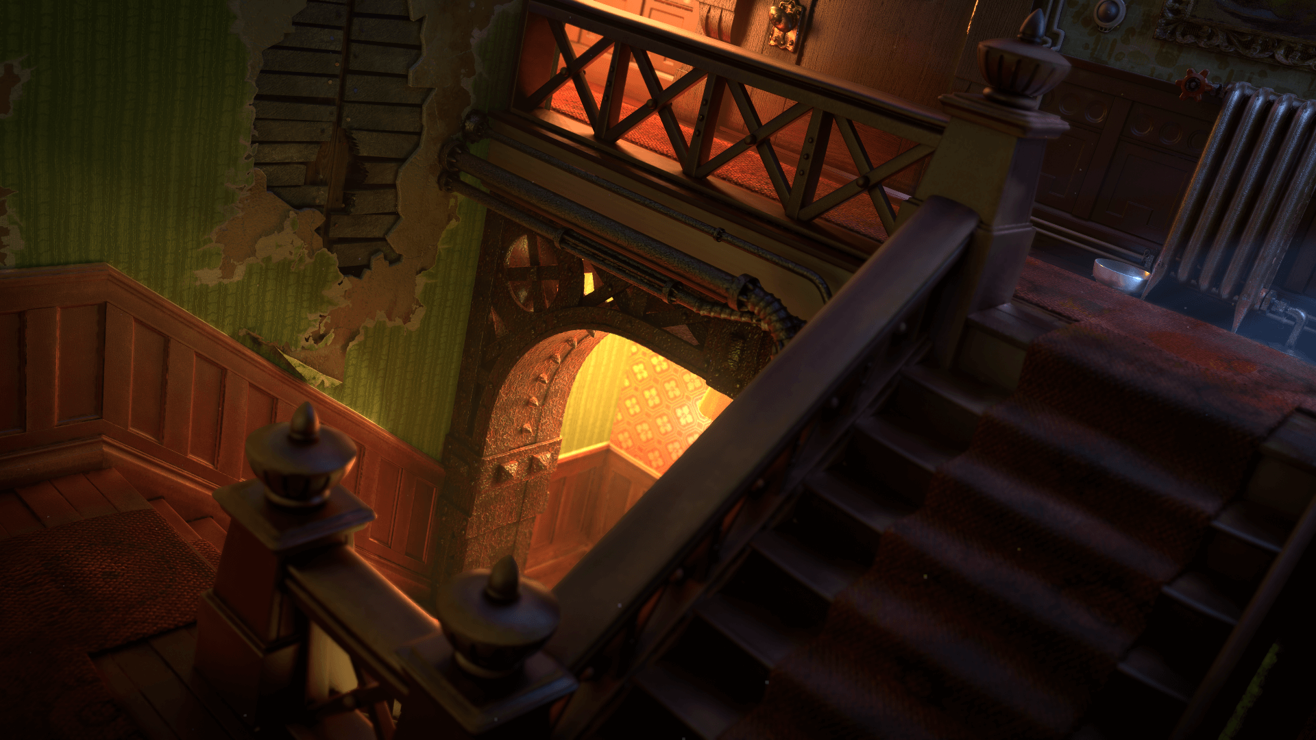
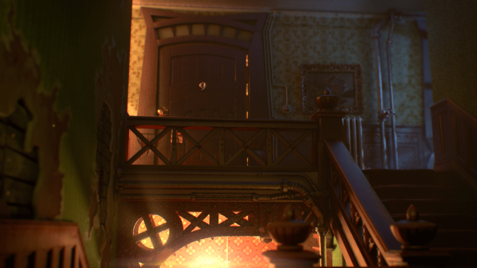
The first thing that I did was to bring the concept art into Maya and converted the 2D space into 3D. I first matched the 3D camera to concept art then I began creating a basic layout using low res geometry to block in the space. From there, I further refined the geometry to do the initial set dressing of the shot. I later created additional camera angles once the environment was further fleshed out. I originally called this project “Sully’s Stairwell” for obvious reasons, but it’s actually a stairwell leading up to Mike’s apartment. At the time, I thought it would be neat to create Sully and Boo as pictured in the early concept. Maybe I’ll revisit that idea one day just for kicks.
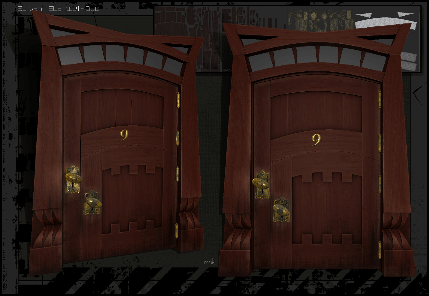
From that point, I modeled, texture mapped and shaded the final assets. For the door, I borrowed from the door design that was actually used in the movie. Above is a close-up of the door (rendered in Mari). I used my clay set dress model to do the initial lighting and refined the light using the final assets with their materials in place. I chose not to go with super low key lighting for the simple fact that I wanted to show more shader detail. I actually regret that decision in hind sight and wish I had remained to committed to the original sketch. My concern at the time was that such a stark 3D rendering could not hold up on its own out of the context of the original sketch. I still believe that but I do wish I had taken the chance at that time. I used Maya, Relight and Renderman (REYES) to generate the images. I used volumes for atmosphere and Maya particles for floating particulate matter and dust. I composited everything in Nuke.
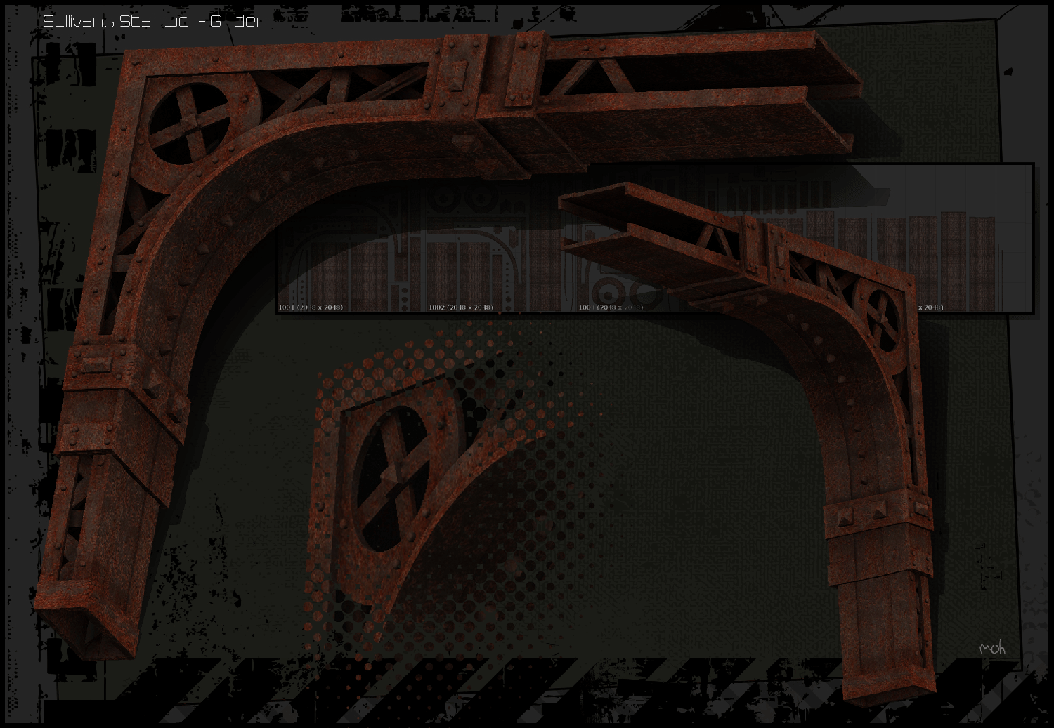
One note about the final images, a couple of other things I would change about this scene is that I went waaaay to far with the bump on the procedurally shaded girder in the final scene renderings. Also, I wish I had blown out the lower stairwell more in the second rendering of the scene to come close to the orginal sketch. Aside from that, I really enjoyed following Louis’ footsteps and getting closer to of his work. I just thought it would be neat to see some of Pixar’s early concept work fully fleshed out in CG. It really gave a lot of insight into what processes maybe undertaken and what considerations may be explored to bring a 2D scene into the 3D world.
-m